


documenting updates,
thoughts & culture.
Notes

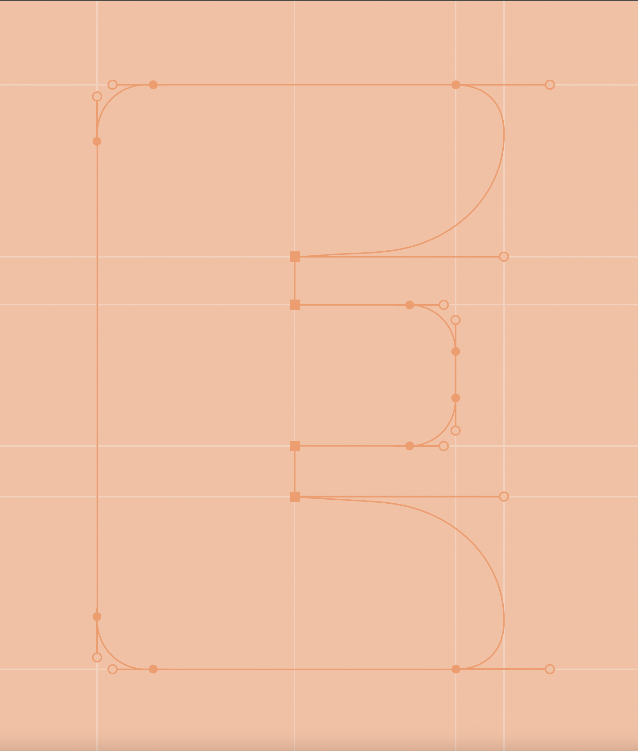
DD ParkoPlay is a custom display typeface inspired by the ParkoPlay logo, featuring bold curves and soft geometry to express playfulness, warmth, and energy—designed for impactful titles, signage, and large-scale applications.
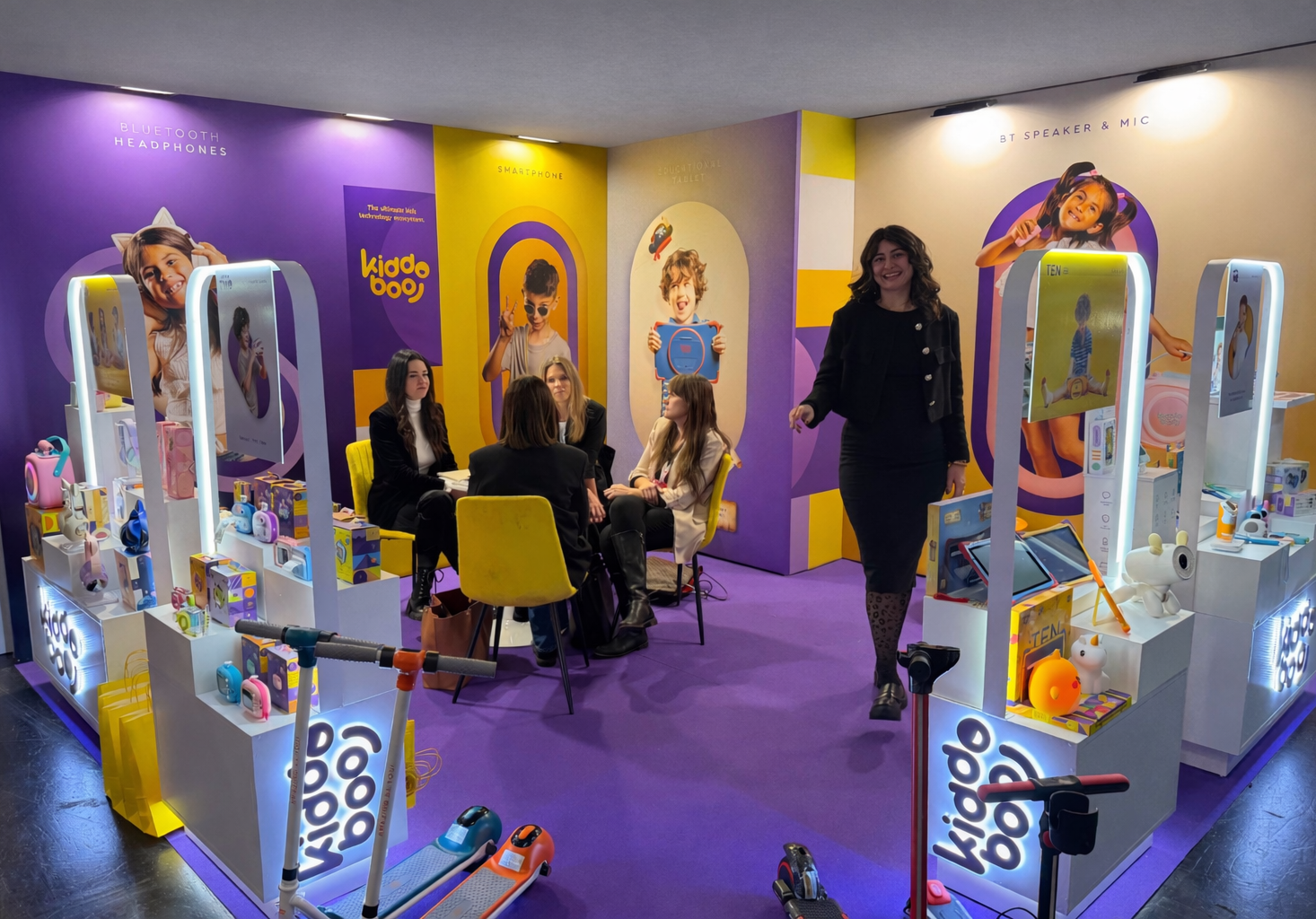
With a custom designed booth and product displays, we helped Kiddoboo materialise their vision for Spielwarenmesse 2026 Exhibition.

We are honoured to have our creative director, Angelos Ntinas, serve as an online jury member for the category of Branding & Design for Ermis Awards 2025.
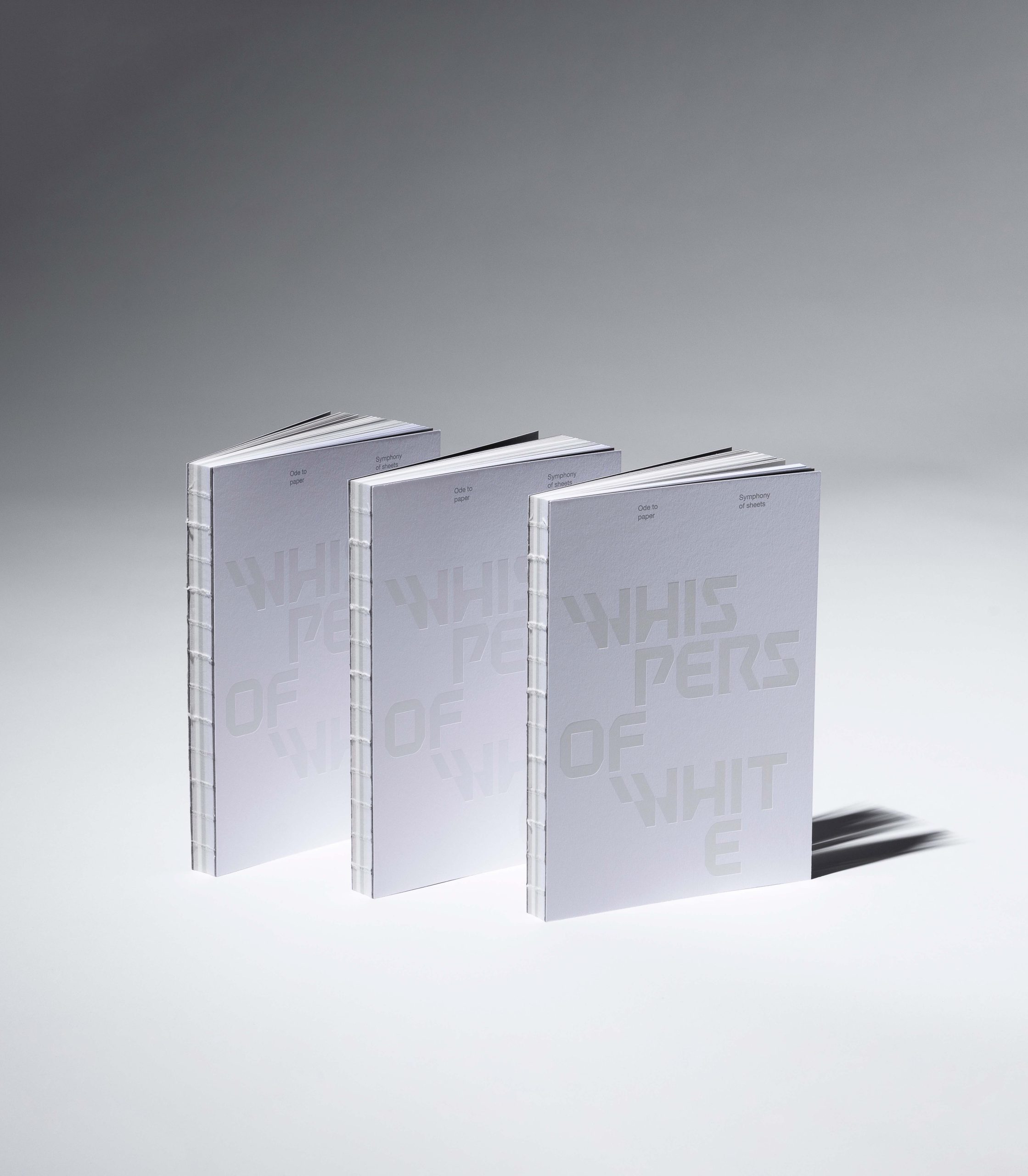
It features four different white papers, highlighting subtle variations in texture, weight, and brightness. White foil on the covers and silver Pantone ink inside create a low-contrast, restrained visual language that allows the paper itself to take center stage. Produced in 400 copies.
Whispers of White – An Ode to Paper is a limited-edition notebook designed for Nazlidis Paper Merchants, exploring white as material and sensory experience.Produced in 400 copies.
Designed for tweens and teens, it offers accessible tech accessories, using the goat as a cultural bridge between the brand and gaming fantasy worlds.
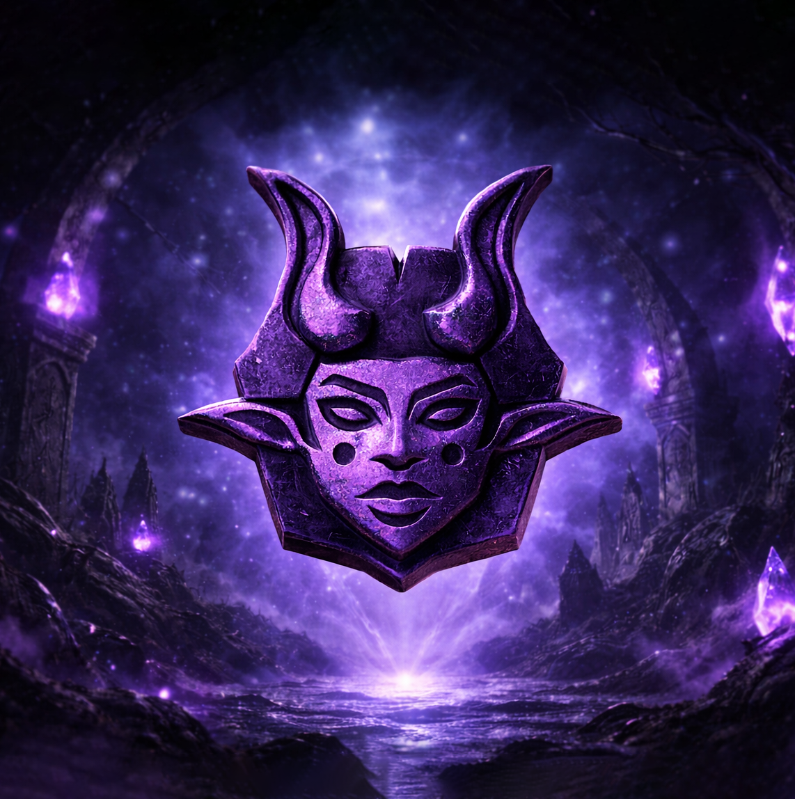
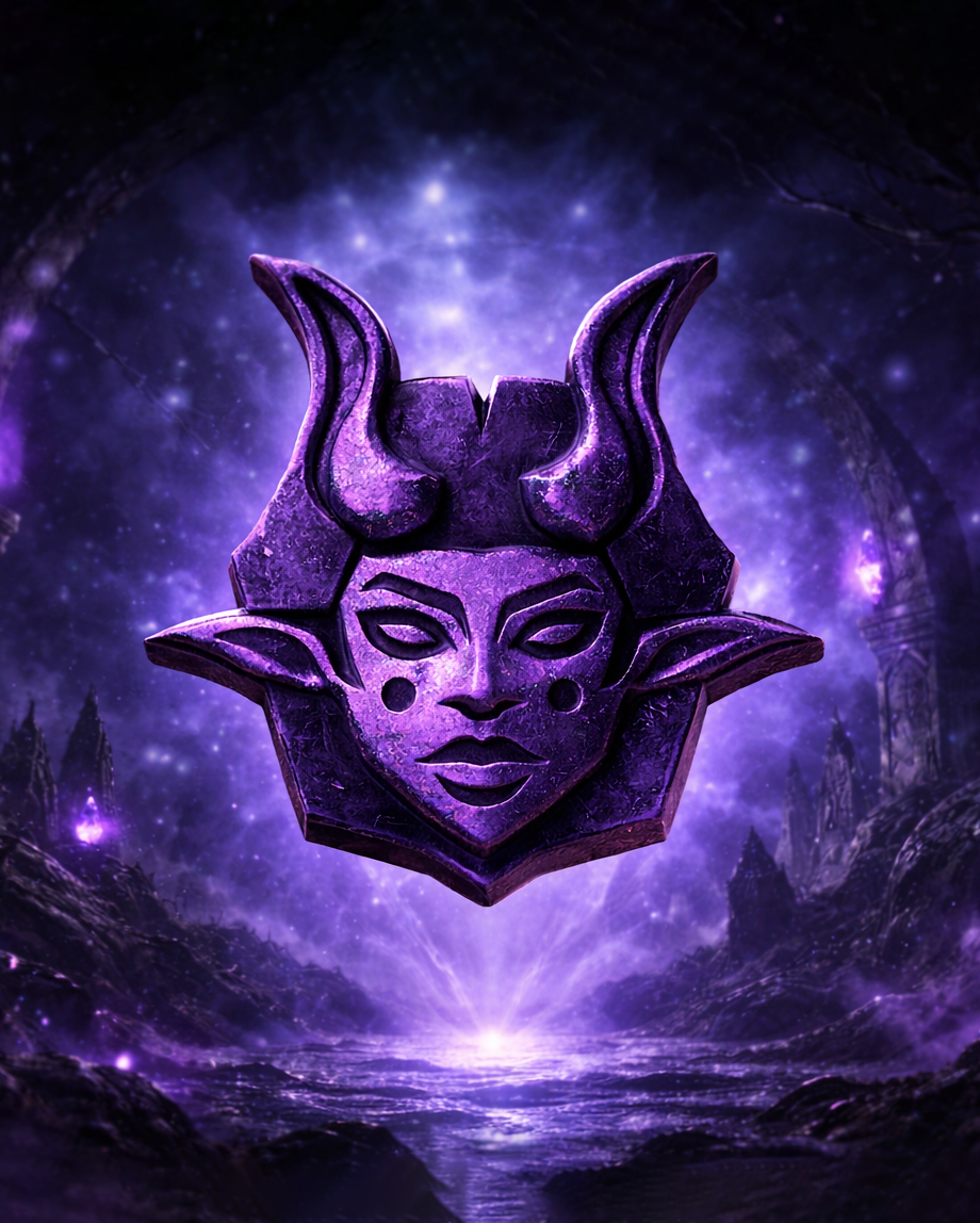
GOAT celebrates the “Greatest Of All Time” with a logo that speaks the language of gamers. Designed for tweens and teens, it offers accessible tech accessories, using the goat as a cultural bridge between the brand and gaming fantasy worlds.
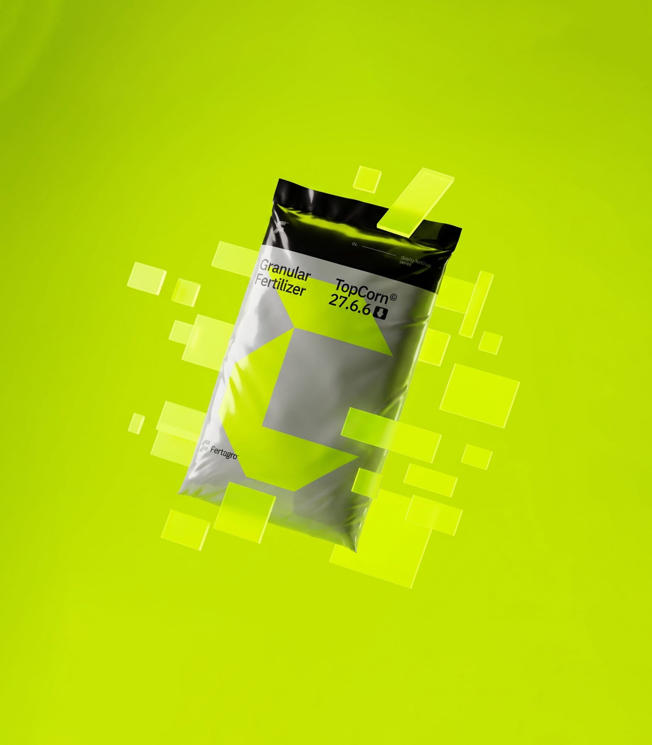
Fertagro’s fertilizer packaging is driven by bold typography and geometric forms, creating clear product differentiation within a modern, structured, and international design system.

We designed a modular brand identity for Kivos Construction, a versatile company with 17 years of experience, that reflects their expertise and adaptability.
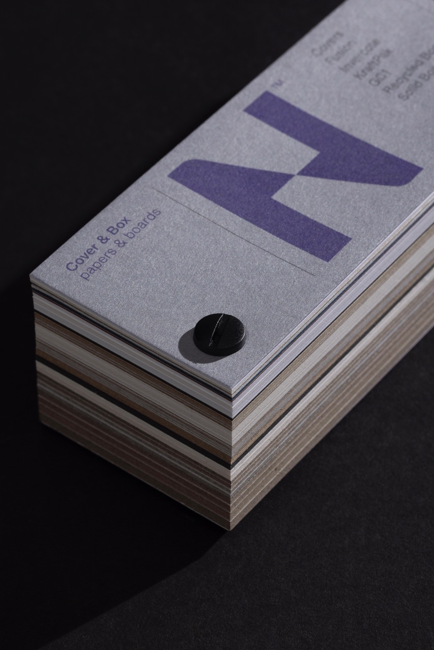
The second part of a paper sampler trifecta, Cover & Box Sampler for Nazlidis Paper Merchants is designed with the same philosophy, showcasing material and form through a purely typographic visual system.
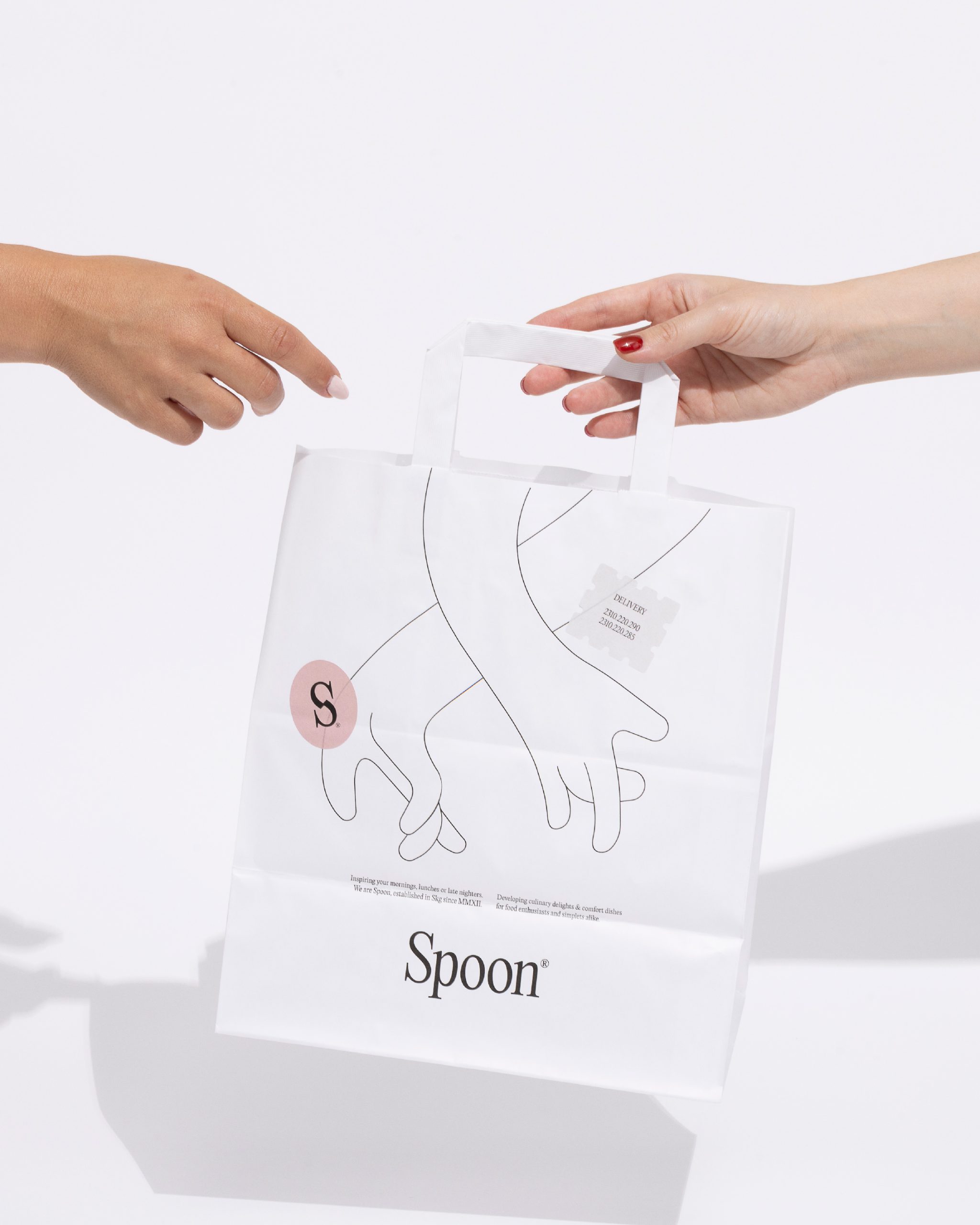
Spoon’s identity and packaging series celebrate everyday coffee & food rituals with minimalist design, soft pastels, and a hand motif symbolizing care and interaction.

Our work involved the development of their new Brand mark and a new packaging system.
Fertagro is a new company specializing in the production and trade of fertilisers. Our work involved the development of their new Brand mark and a new packaging system.
The new Mobistar packaging by Kiddoboo follows a Bauhaus-inspired approach, expressed through a clean and minimalist design.
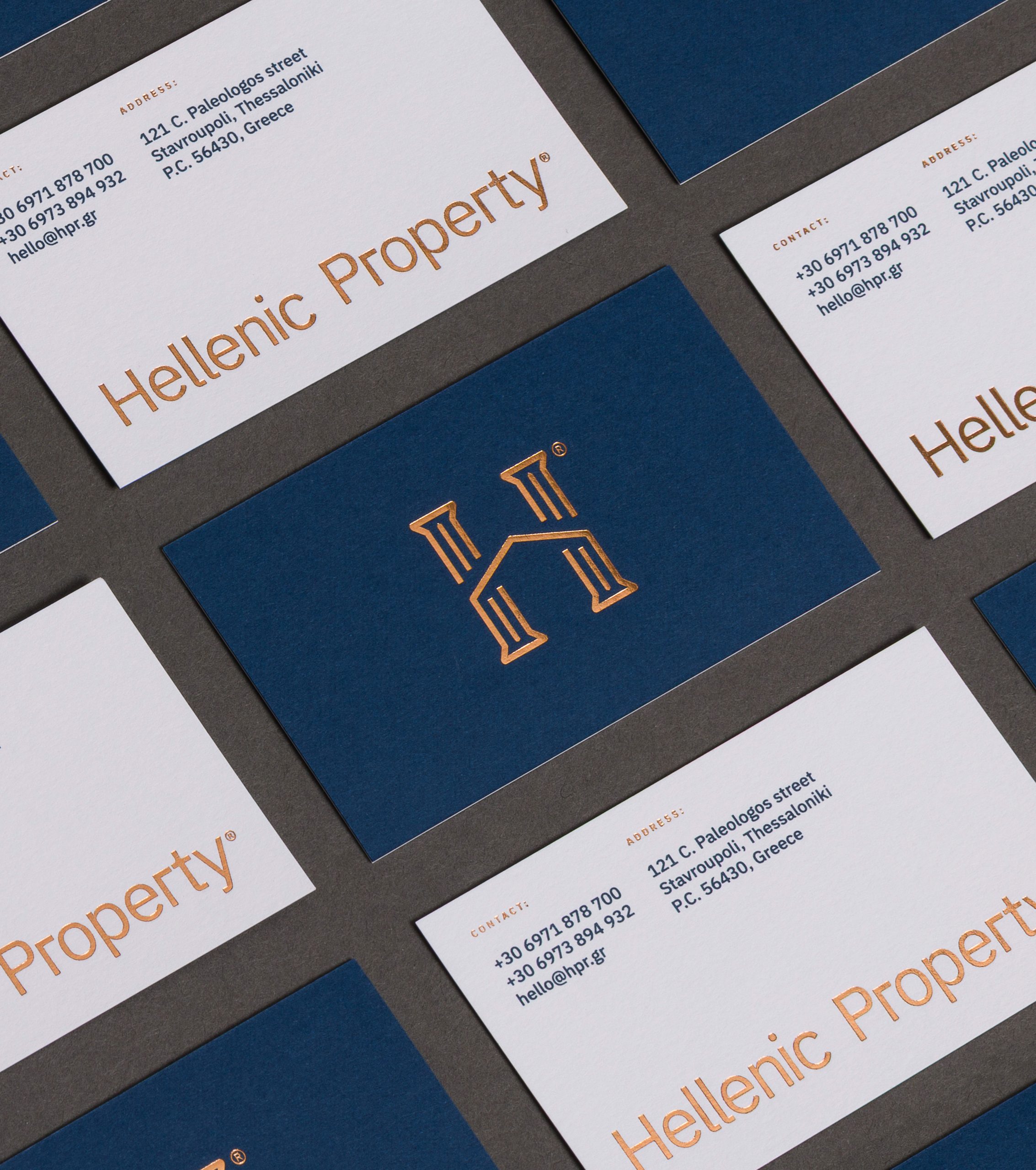
Hellenic Property, a Thessaloniki real estate agency, updated its brand to highlight Greek heritage with a sleek, modern design featuring a logo combining a house and Greek column.
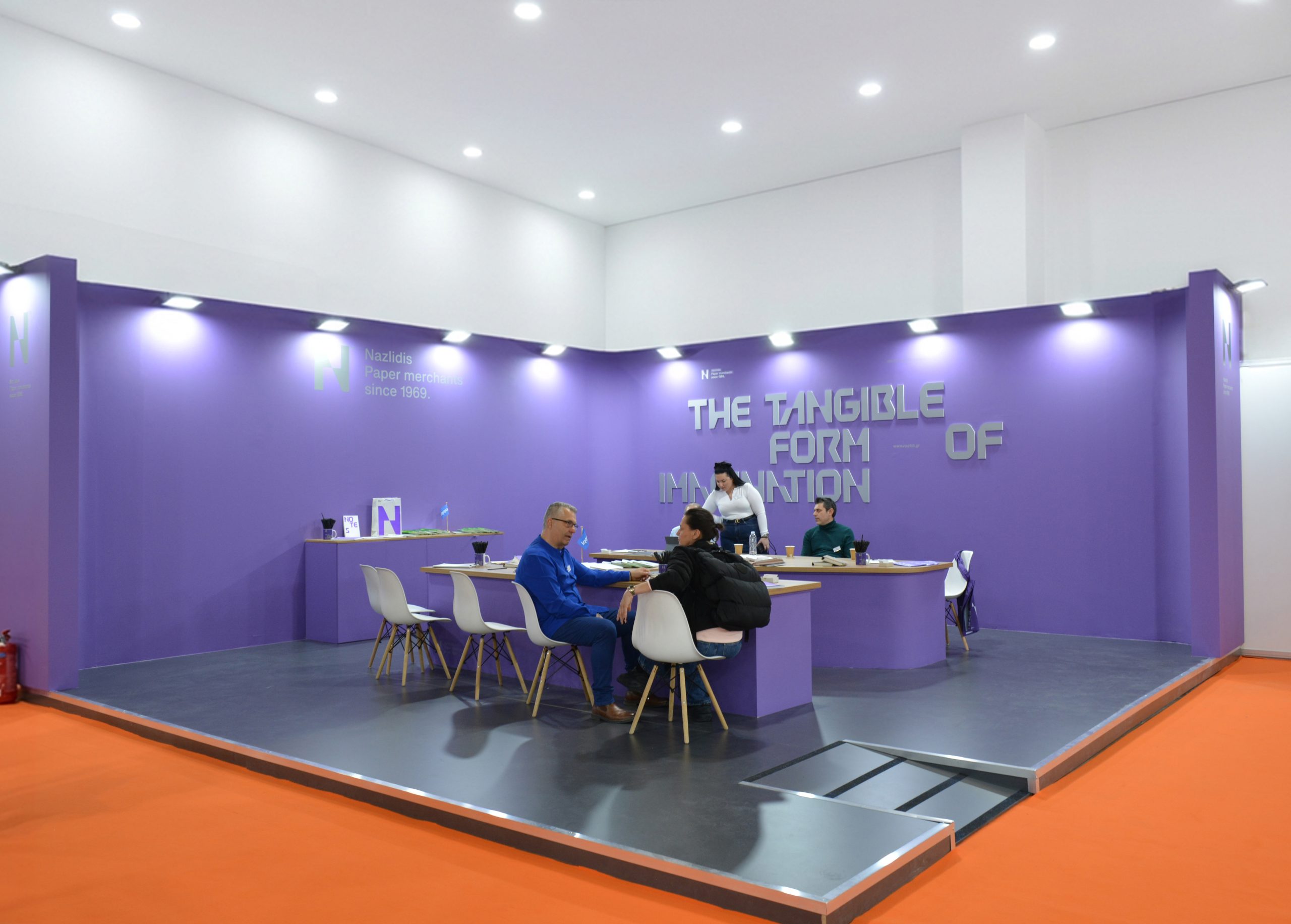
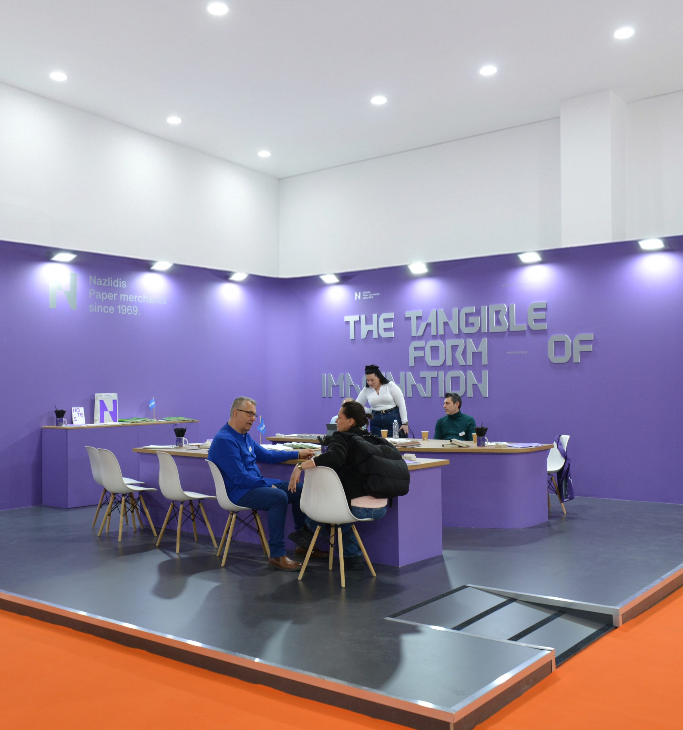
Designed the booth and a custom table for Nazlidis Paper Merchants at GRAPHICA EXPO – Greece’s largest and longest-running trade show for Graphic Arts and Visual Communication.

Dialogue was awarded the Bronze distinction in the category ‘Packaging: Other Packaging’ for its design of the retail packaging series for the children’s technology brand, Kiddoboo.
Ermis Awards, the leading institution celebrating creativity in the field of communication in Greece, awarded Dialogue with a Bronze Award for Kiddoboo packaging series.
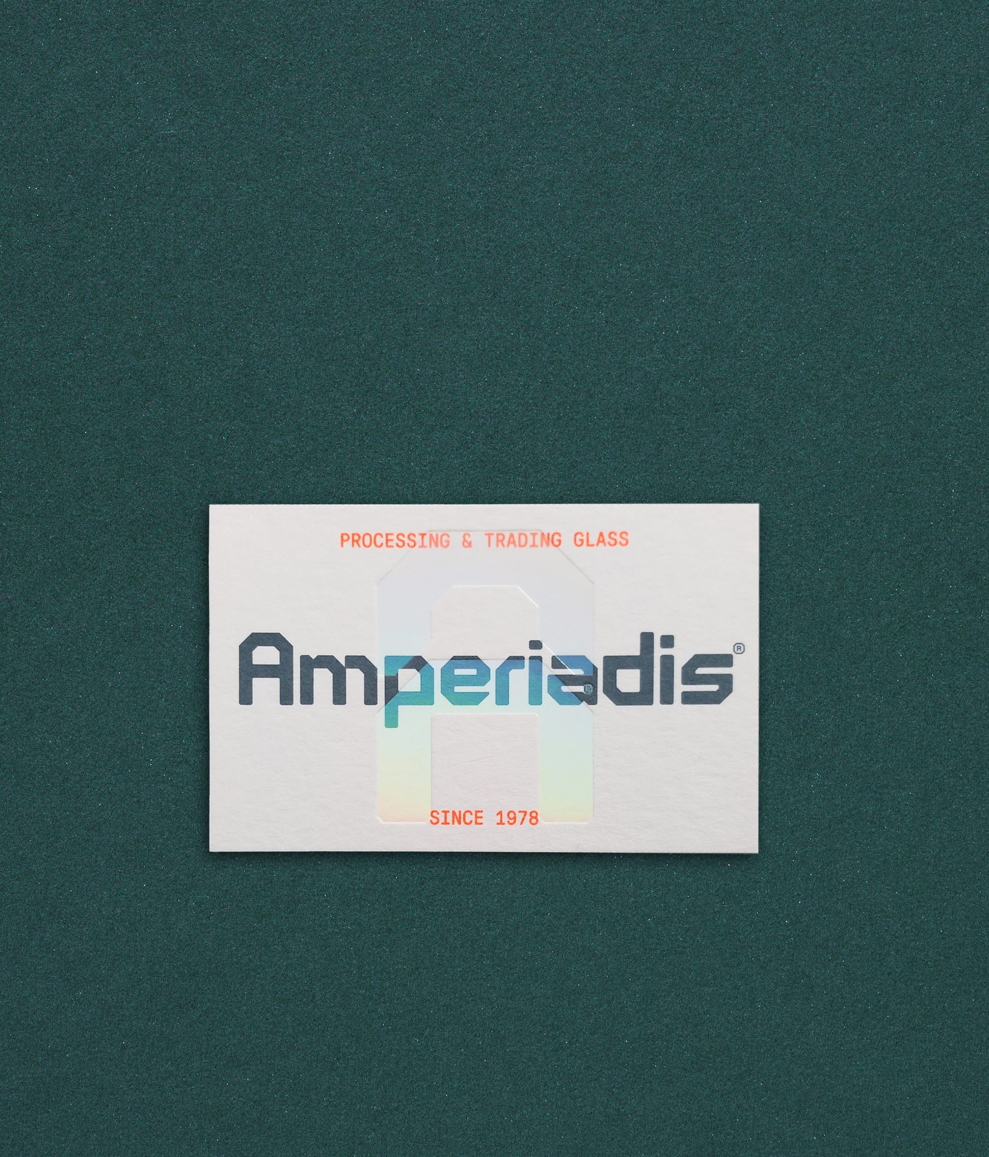
A new brand identity with a custom font for Amperiadis Glass Processing & Trading.

Our approach was rooted in stripping typography of any unnecessary graphic elements. Typography alone became the cornerstone of a bold visual identity, distinctly setting our client apart from the competition.
With established commercial recognition, Nazlidis S.A. entrusted us with redesigning its visual identity, aiming not merely for an evolution of its existing image but for a complete transformation.

Her curiosity and passion for learning drive her to deliver fresh, thoughtful, and innovative design solutions—especially in packaging and illustration, where she continues to hone her craft.
We are excited to welcome Marina Doukaki to Dialogue as a Junior Graphic Designer. Born in Corfu and a graduate of Graphic Design from IEK Delta in Thessaloniki, Marina brings a deep love for books, exploration, and creative thinking to every project.

A space where materials, ideas, and people come together, continuing the conversations that inspire us.
We are excited to announce a new chapter for dialogue. A chapter shaped by fresh perspectives, a new space, and an ongoing commitment to thoughtful design. Our studio has moved into a new home — an environment that reflects the clarity, balance, and aesthetics that define our work.

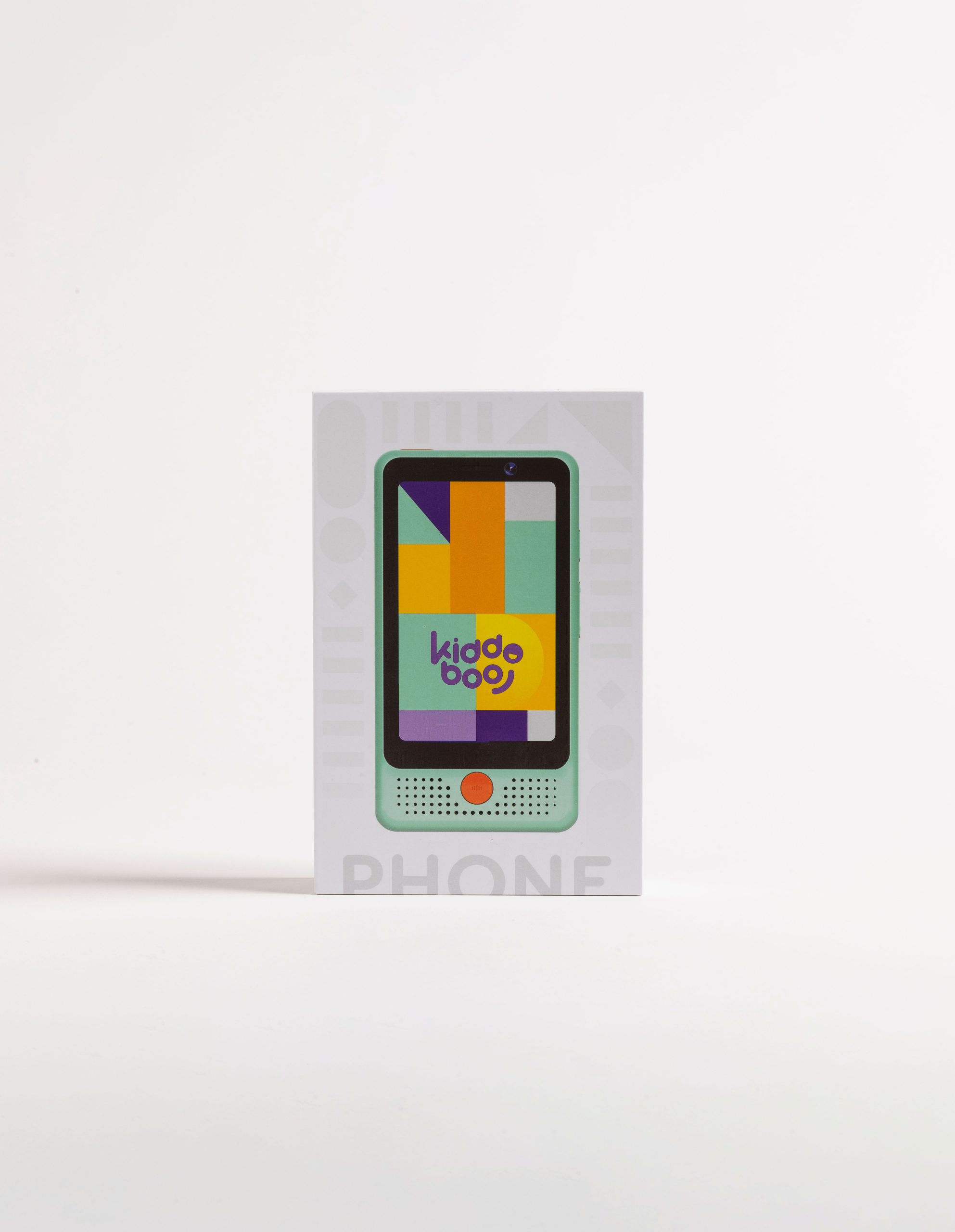
The new Kiddoboo children’s technology product line is designed with a fresh visual language based on geometric shapes, vibrant colors, and the system’s flexibility across multiple applications, making it easily recognizable and distinctive.
DD ParkoPlay is a custom display typeface inspired by the ParkoPlay logo, featuring bold curves and soft geometry to express playfulness, warmth, and energy—designed for impactful titles, signage, and large-scale applications.
With a custom designed booth and product displays, we helped Kiddoboo materialise their vision for Spielwarenmesse 2026 Exhibition.
We are honoured to have our creative director, Angelos Ntinas, serve as an online jury member for the category of Branding & Design for Ermis Awards 2025.
It features four different white papers, highlighting subtle variations in texture, weight, and brightness. White foil on the covers and silver Pantone ink inside create a low-contrast, restrained visual language that allows the paper itself to take center stage. Produced in 400 copies.
Whispers of White – An Ode to Paper is a limited-edition notebook designed for Nazlidis Paper Merchants, exploring white as material and sensory experience.Produced in 400 copies.
Designed for tweens and teens, it offers accessible tech accessories, using the goat as a cultural bridge between the brand and gaming fantasy worlds.
GOAT celebrates the “Greatest Of All Time” with a logo that speaks the language of gamers. Designed for tweens and teens, it offers accessible tech accessories, using the goat as a cultural bridge between the brand and gaming fantasy worlds.
Fertagro’s fertilizer packaging is driven by bold typography and geometric forms, creating clear product differentiation within a modern, structured, and international design system.
We designed a modular brand identity for Kivos Construction, a versatile company with 17 years of experience, that reflects their expertise and adaptability.
The second part of a paper sampler trifecta, Cover & Box Sampler for Nazlidis Paper Merchants is designed with the same philosophy, showcasing material and form through a purely typographic visual system.
Spoon’s identity and packaging series celebrate everyday coffee & food rituals with minimalist design, soft pastels, and a hand motif symbolizing care and interaction.
Our work involved the development of their new Brand mark and a new packaging system.
Fertagro is a new company specializing in the production and trade of fertilisers. Our work involved the development of their new Brand mark and a new packaging system.
The new Mobistar packaging by Kiddoboo follows a Bauhaus-inspired approach, expressed through a clean and minimalist design.
Hellenic Property, a Thessaloniki real estate agency, updated its brand to highlight Greek heritage with a sleek, modern design featuring a logo combining a house and Greek column.
Designed the booth and a custom table for Nazlidis Paper Merchants at GRAPHICA EXPO – Greece’s largest and longest-running trade show for Graphic Arts and Visual Communication.
Dialogue was awarded the Bronze distinction in the category ‘Packaging: Other Packaging’ for its design of the retail packaging series for the children’s technology brand, Kiddoboo.
Ermis Awards, the leading institution celebrating creativity in the field of communication in Greece, awarded Dialogue with a Bronze Award for Kiddoboo packaging series.
A new brand identity with a custom font for Amperiadis Glass Processing & Trading.
Our approach was rooted in stripping typography of any unnecessary graphic elements. Typography alone became the cornerstone of a bold visual identity, distinctly setting our client apart from the competition.
With established commercial recognition, Nazlidis S.A. entrusted us with redesigning its visual identity, aiming not merely for an evolution of its existing image but for a complete transformation.
Her curiosity and passion for learning drive her to deliver fresh, thoughtful, and innovative design solutions—especially in packaging and illustration, where she continues to hone her craft.
We are excited to welcome Marina Doukaki to Dialogue as a Junior Graphic Designer. Born in Corfu and a graduate of Graphic Design from IEK Delta in Thessaloniki, Marina brings a deep love for books, exploration, and creative thinking to every project.
A space where materials, ideas, and people come together, continuing the conversations that inspire us.
We are excited to announce a new chapter for dialogue. A chapter shaped by fresh perspectives, a new space, and an ongoing commitment to thoughtful design. Our studio has moved into a new home — an environment that reflects the clarity, balance, and aesthetics that define our work.
The new Kiddoboo children’s technology product line is designed with a fresh visual language based on geometric shapes, vibrant colors, and the system’s flexibility across multiple applications, making it easily recognizable and distinctive.


